helping organizations better understand, manage, and optimize their cloud costs.

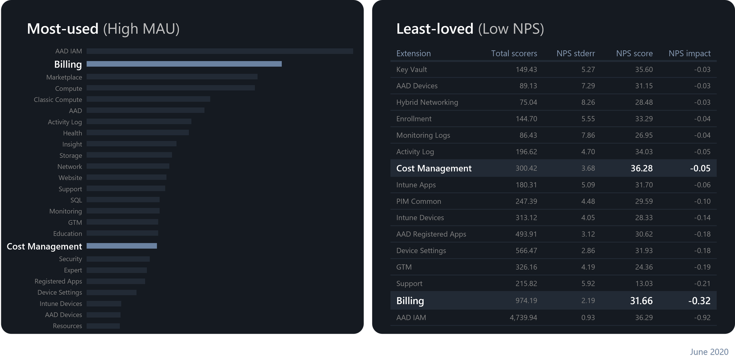
By 2020, Cost Management and Billing had some of the highest monthly active usage in Azure — with Billing ranking #2 overall. But despite the high usage, they were also among the least loved services, consistently showing low NPS scores, with Billing near the bottom.
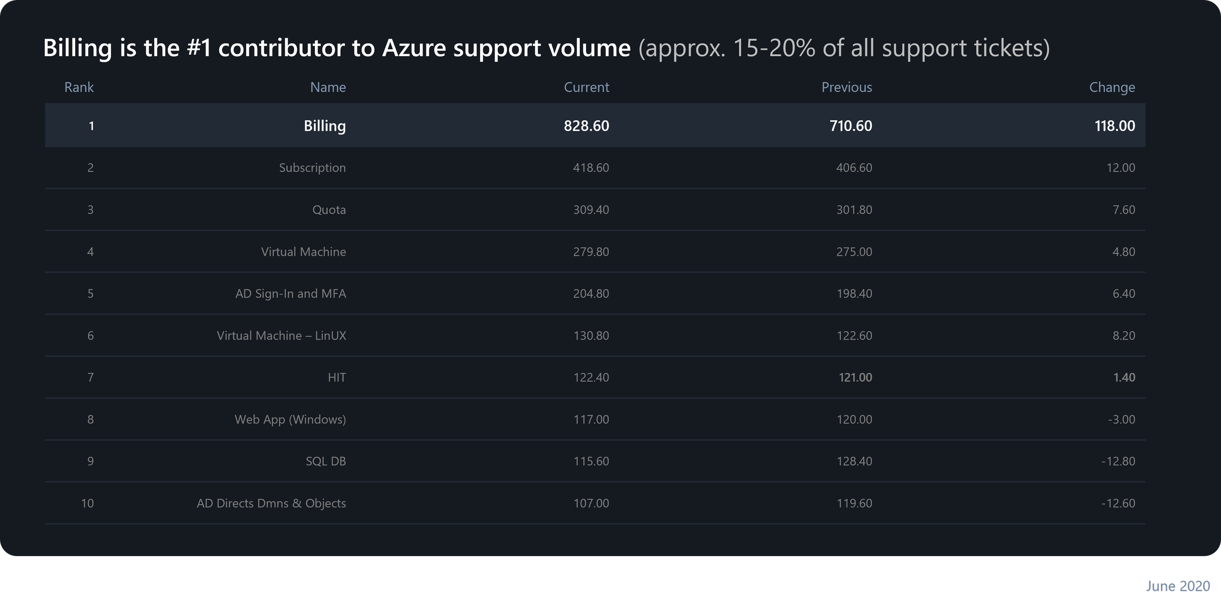
Billing was also the #1 contributor to Azure support tickets — which, in this case, wasn’t something to be proud of. It accounted for roughly 20 to 30 percent of all weekly support volume. In June 2020 alone, we saw over 8,20 support tickets — double the number of the next highest service. Clearly, the experience wasn’t just frustrating customers — it was also driving significant operational cost.
MY ROLE & THE V-TEAM
As the lead designer for this project, I was responsible for defining the overall vision, design principles, and North Star strategy. I created the high-level design plan and initiated the first rounds of field studies — before we even had a researcher onboard or our focus areas defined — to ground the work in real customer insights from the very beginning. From there, I built and led a cross-disciplinary UX V-team to continue the research, collaborated with designers to co-design key experiences, and partnered closely with PM and engineering to turn our North Star vision into tangible outcomes. I also presented our design vision and progress to the leadership team, ensuring our work stayed connected to business priorities and informed long-term planning.
RESEARCH
When we began, most of our Cost Management and Billing research work was usability-focused — testing screens rather than understanding users. We lacked foundational knowledge about our customers, their workflows, and their pain points. So, we launched a series of generative research activities to close that gap and build a more complete understanding of the people behind the data.
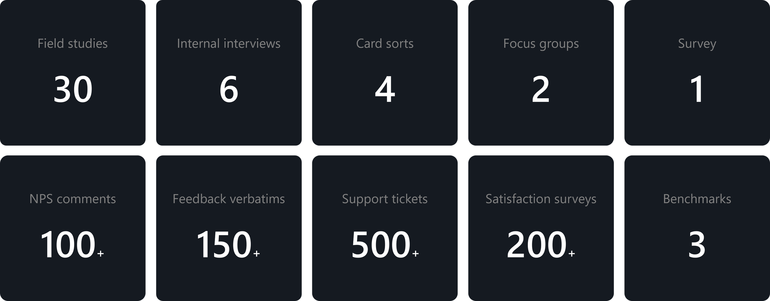
USER MODELS
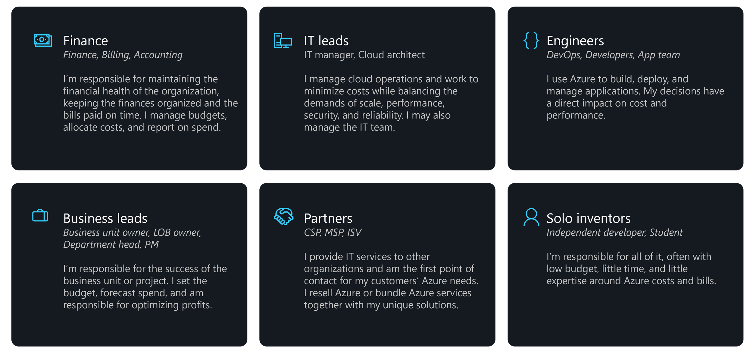
From that research, we developed 6 user models that represent the key groups interacting with Azure Cost Management and Billing — from finance teams and business leads to IT admins, engineers, partners, and even independent developers. These models helped us understand who uses cost and billing tools, their motivations, and the unique challenges each role faces when managing cloud costs. This clarity allowed us to design experiences that meet each user where they are — whether they care about financial accuracy, operational efficiency, or technical performance.
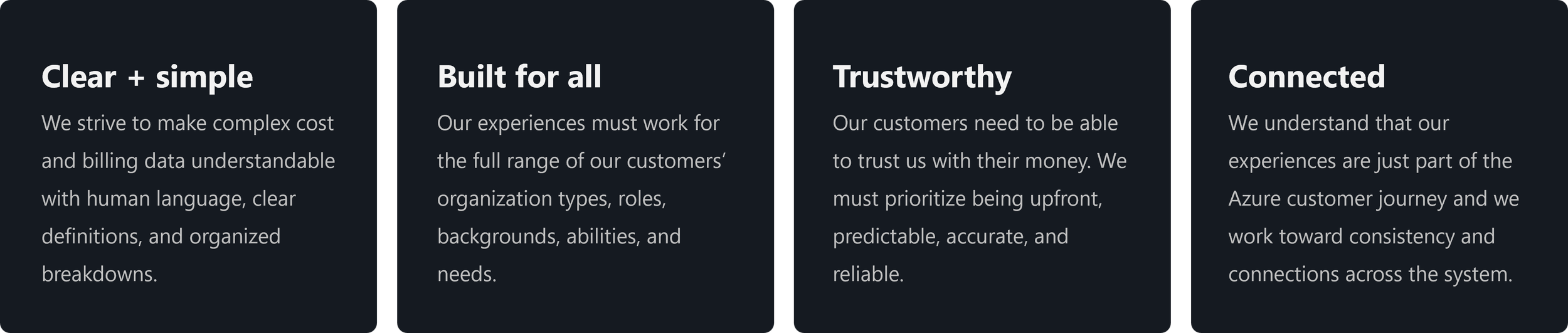
DESIGN PRINCIPLES
Our insights led to four core design principles that shaped our North Star vision and continue to guide our work today.
DESIGN FOCUS AREAS
Our mission for this North Star effort was simple but powerful — to take the anxiety and time out of managing finances, so our customers can return to doing what they do best — re-inventing with purpose. We’ve defined four focus areas that will drive the biggest impact.
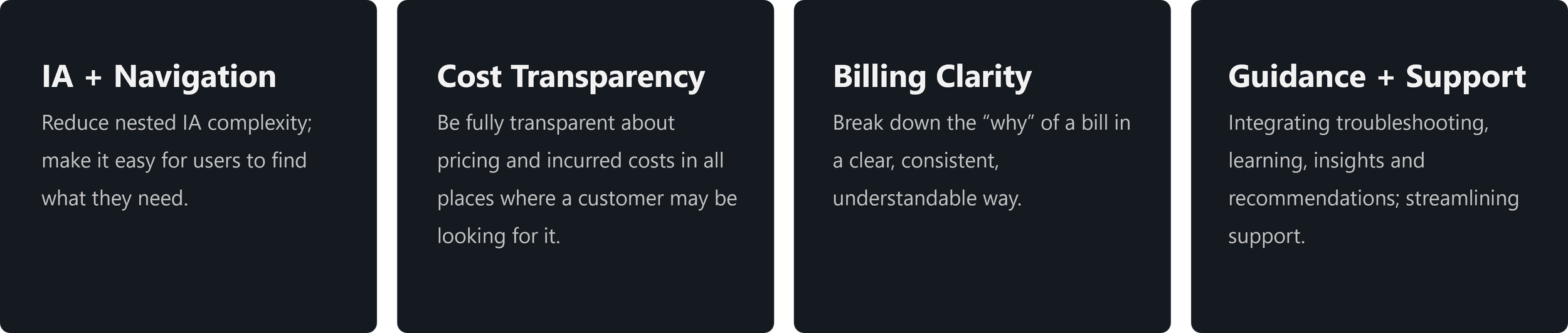

Reduce nested IA complexity; make it easy for users to find what they need.
RESERACH INSIGHTS
Our research revealed that one of the most common frustrations for users is navigating between different Cost Management and Billing areas just to understand their costs or find invoices. Nearly one-third of negative NPS comments for Billing mentioned words like ‘complex,’ ‘complicated,’ or ‘confusing.’These sentiments reflect how disjointed and unintuitive the current navigation structure feels to our users.
CUSTOMER FEEDBACK
“I struggle with [finding invoices] every time I look for them. This time I don’t see anything anywhere and searching for ‘invoices’ does not work.“
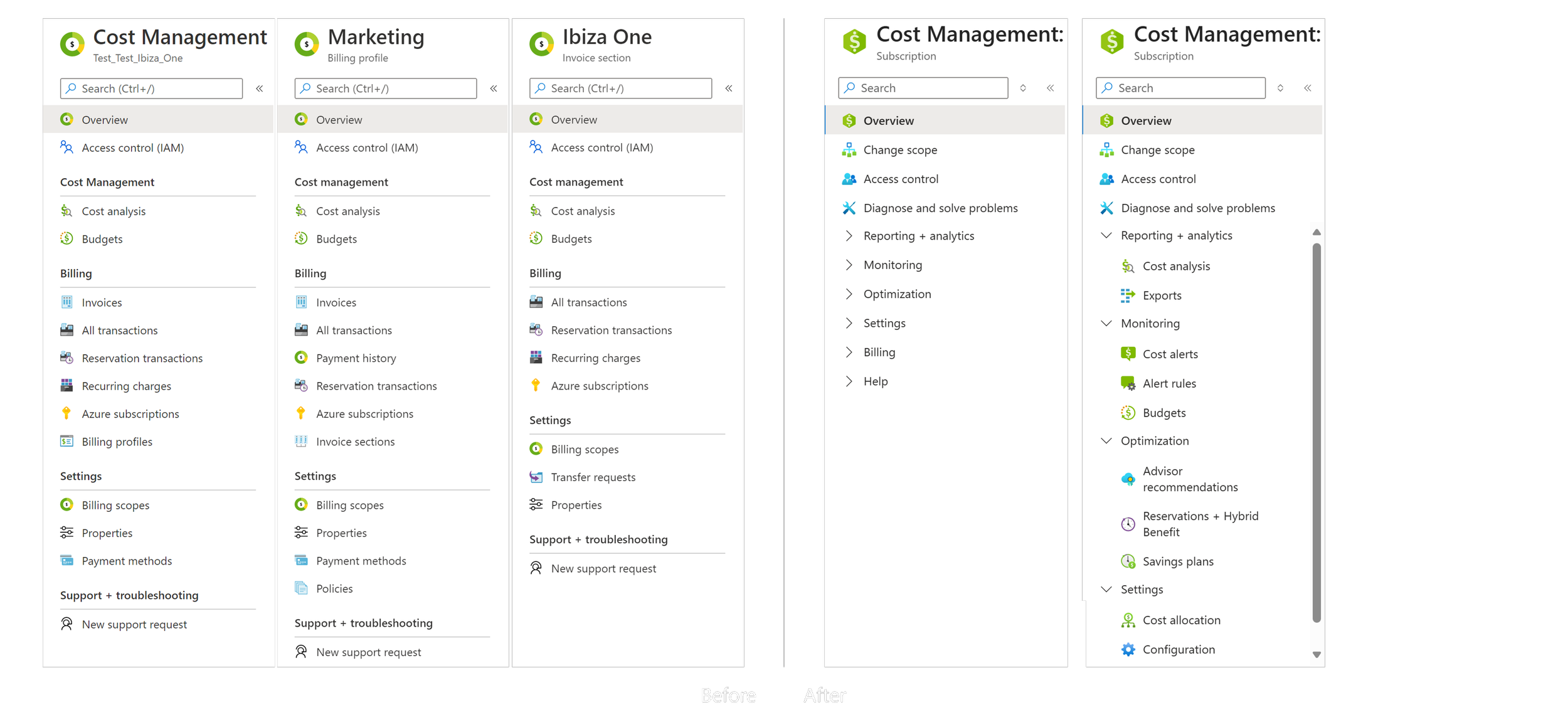
BEFORE
Depending on which billing scope a user was in, they were presented with different menus, often missing key options.
AFTER
We conducted a series of card-sorting studies to inform our Information Architecture improvements. Tying this back to our UX principle of being ‘Clear and Simple’, our goal for the Cost Management and Billing navigation is to create a single, predictable, and consistent experience — one that consolidates all cost and billing features into a unified structure. This design allows customers to scope and pivot their data without jumping between completely different pages.
Be fully transparent about pricing and incurred costs in all places where a customer may be looking for it.
RESERACH INSIGHTS
We’ve received consistent feedback that many users don’t have a clear picture of their bills, and that confusion is a major driver of negative NPS. One of the top themes in Cost Management and Billing feedback is unexpected charges — especially from trial periods or pay-as-you-go resources that were left running
CUSTOMER FEEDBACK
“This feels like I have been scammed…[Pay-as-you-go] was suggested to me as a way to not have costs if I am not using the service…. However you are still billing me. This feels like bait and switch.”
AFTER
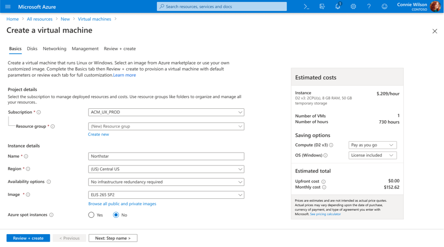
Our goal in this area was to make costs visible, predictable, and traceable throughout the entire lifecycle not just at the end of the month when the bill arrives, but before resources are created, while they’re running, and after usage accumulates.
Here you can see an example of this approach already in the product today — when creating a virtual machine, customers now see an estimated cost preview directly in the configuration flow. This gives users a clear sense of the financial impact before deployment, which builds confidence and reduces surprises later.
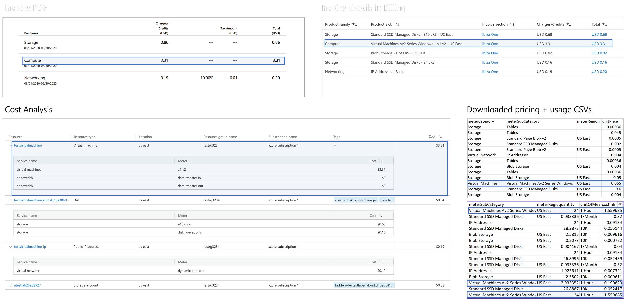
Break down the “why” of a bill in a clear, consistent, understandable way.
RESERACH INSIGHTS
Clarifying bills has proven to be a major support issue. We received roughly 1,500 support incidents every month related to billing and pricing. Customers described the experience as ‘cumbersome’ and ‘hard to understand’ — and their top concern was making sure they’re only being charged for what they actually used.
CUSTOMER FEEDBACK
“I have used Microsoft for my entire career, 20+ years. I have no idea, I cannot figure out the naming conventions in the invoices, the line items.“
BEFORE
To help billing explainable, navigable, and human-understandable. We highlighted actionable bills that need attention, with the ability to multi-select invoices for easier downloading, sending, or paying. We also explored comparative views, allowing users to compare invoices directly in the context pane.
AFTER
To help billing explainable, navigable, and human-understandable. We highlighted actionable bills that need attention, with the ability to multi-select invoices for easier downloading, sending, or paying. We also explored comparative views, allowing users to compare invoices directly in the context pane.

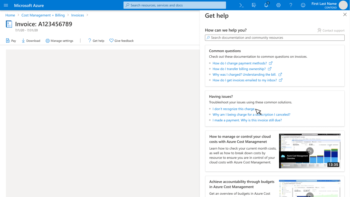
Integrating troubleshooting, learning, insights and recommendations; streamlining support.
BEFORE
Customers could find common issues and support documentation through the Diagnose and Solve Problems page — shown here on the left — and a troubleshooting tool that recommends solutions when creating a new support ticket — shown on the right.
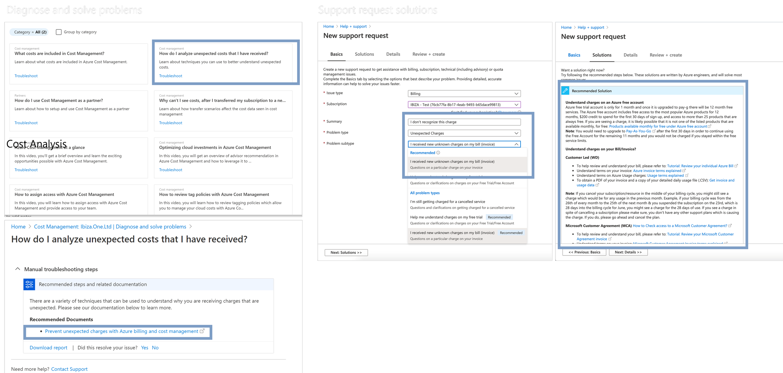
AFTER
To further improve the experience, we brought those common issues, troubleshooting flows, and documentation directly to users — contextually, when and where they need them. We introduced a ‘Get Help’ entry point available on every page. From there, users can explore related documentation, how-to videos, and common issues without leaving their workflow.