Aligning a large enterprise platform with a new design system to elevate consistency, usability, and brand cohesion.

In 2017, Microsoft Fluent Design System was unveiled. It is an open-source, cross-platform design system that gives designers and developers the frameworks they need to create engaging product experiences — accessibility, internationalization, and performance included. When it was released, it primarily focused on UWP (Universal Windows Platform). It was unclear how web experience looks like in Fluent. In 2018, I led a project to fluentize Azure — refreshing the look and feel of the Microsoft Azure portal. The improvements we made increase productivity, improve accessibility, and make better use of our customers’ valuable screen real estate.
I was 1 of 2 lead designers of this project. I primarily drove the designs of depth story, color themes, navigations and dashboard page (previous homepage). Before this project, I had worked in Windows and Devices group for 1.5 year. That experience helped me to build relationships with the people from Windows team and Fluent team, which empowered me to drive this project smoothly.
MY ROLE & THE V-TEAM
FLUENT BUILDING BLOCKS
There are 5 building blocks in the Fluent Design System. In the Ignite Release, we used depth and light. We didn’t use motion and material because of the performance concern. We don’t support 0D and 3D experience, so we didn’t use scale.

VIDEO

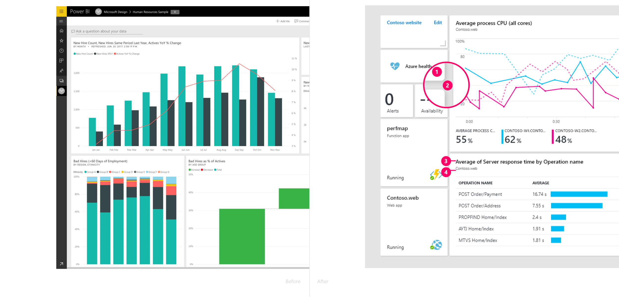
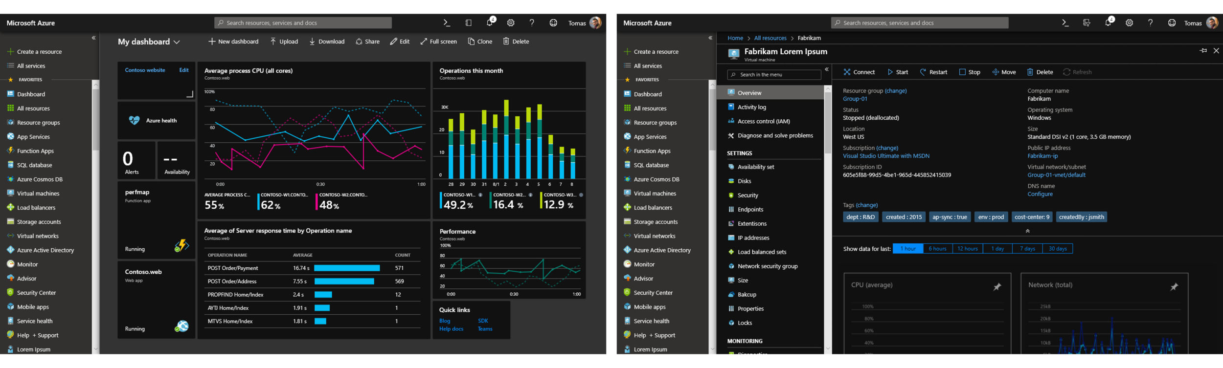
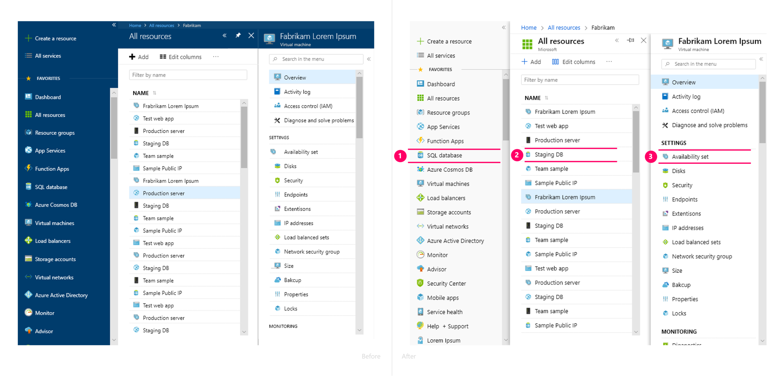
In the Azure Portal, users start from the navigation pane, which we defined as the bottom layer. As users move deeper, new layers open — and the header, which impacts all pages, becomes the top layer. This layering helps users understand where they are, what’s persistent, and what’s contextual — creating a more structured and intuitive experience.
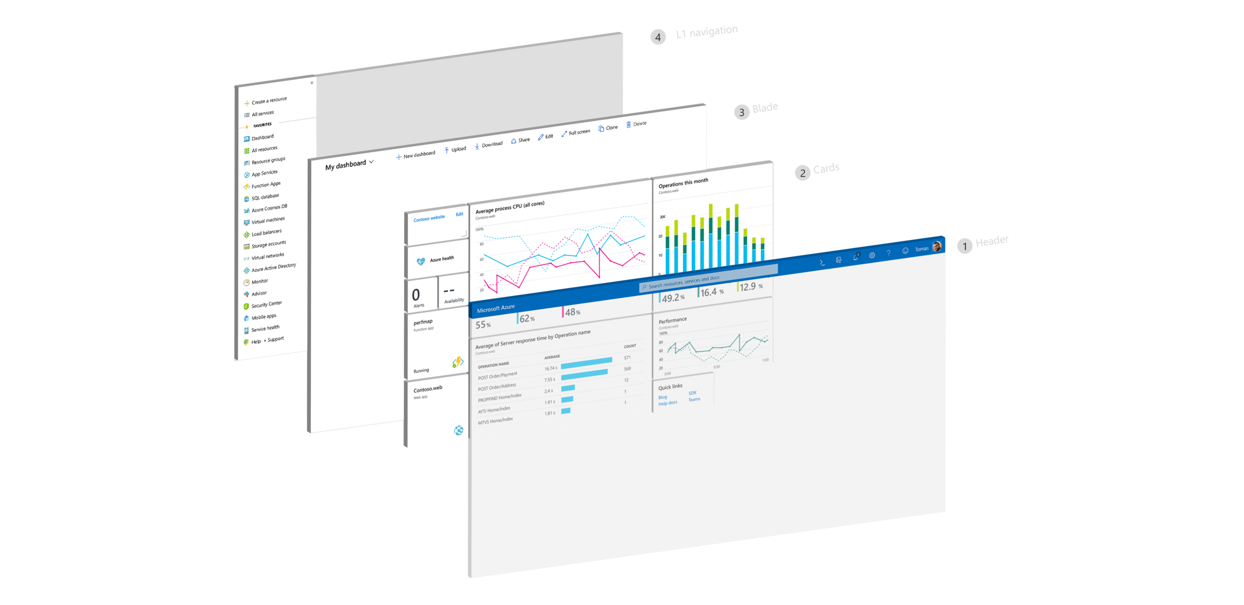

The main blade always carries the highest contrast ratio, ensuring users instantly see where to focus. We achieved this through shadows and subtle shades of gray — small, systematic changes that define hierarchy without visual noise. The result is a cleaner, lighter, and more modern portal that feels unmistakably Fluent.


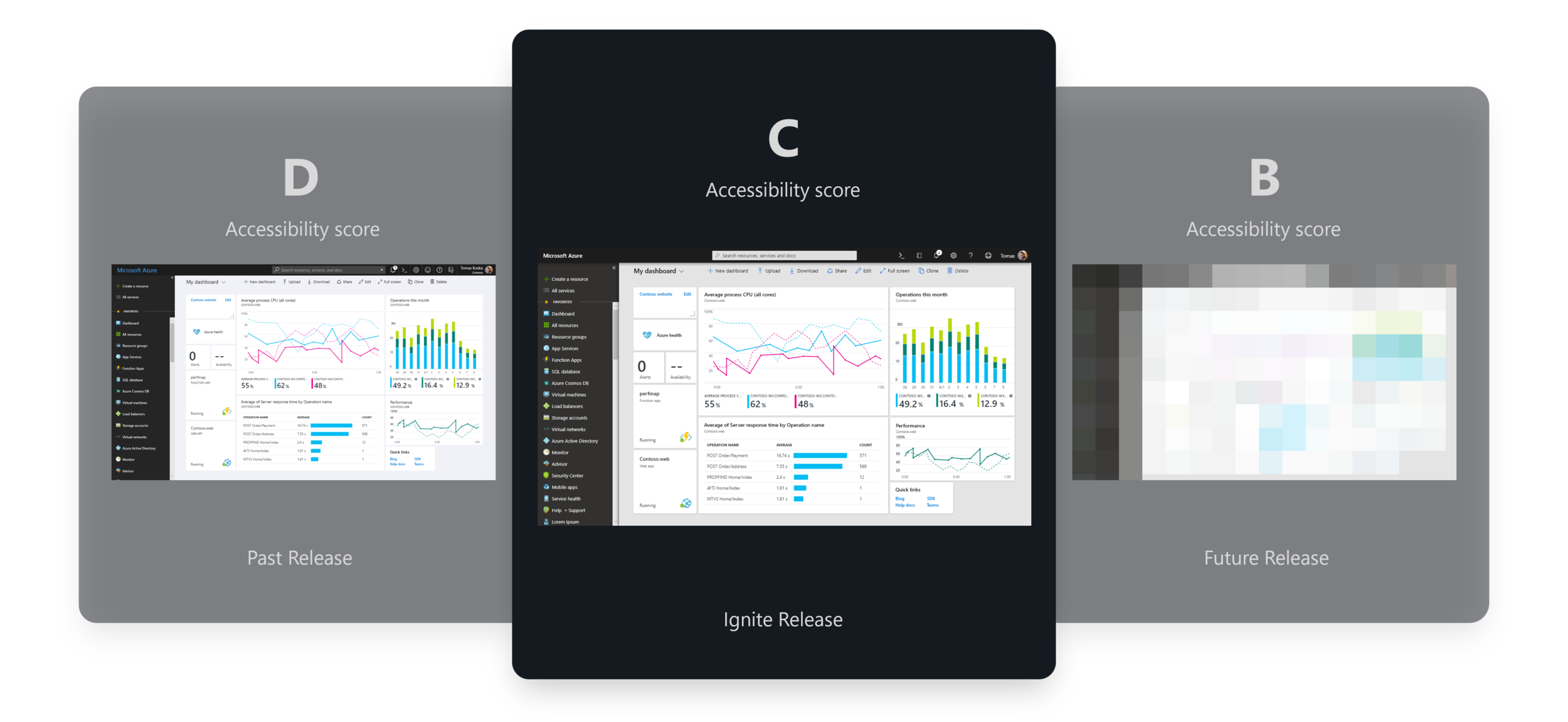
Previously, the portal’s accessibility score was a D. Through steady improvement, we raised it to a C, and with Fluent updates, we maintained that C. To reach a B rating, visual updates alone won’t be enough — we’ll need to enhance interaction design for better usability and keyboard navigation. This Fluent work laid that foundation — setting the stage for deeper accessibility improvements.”

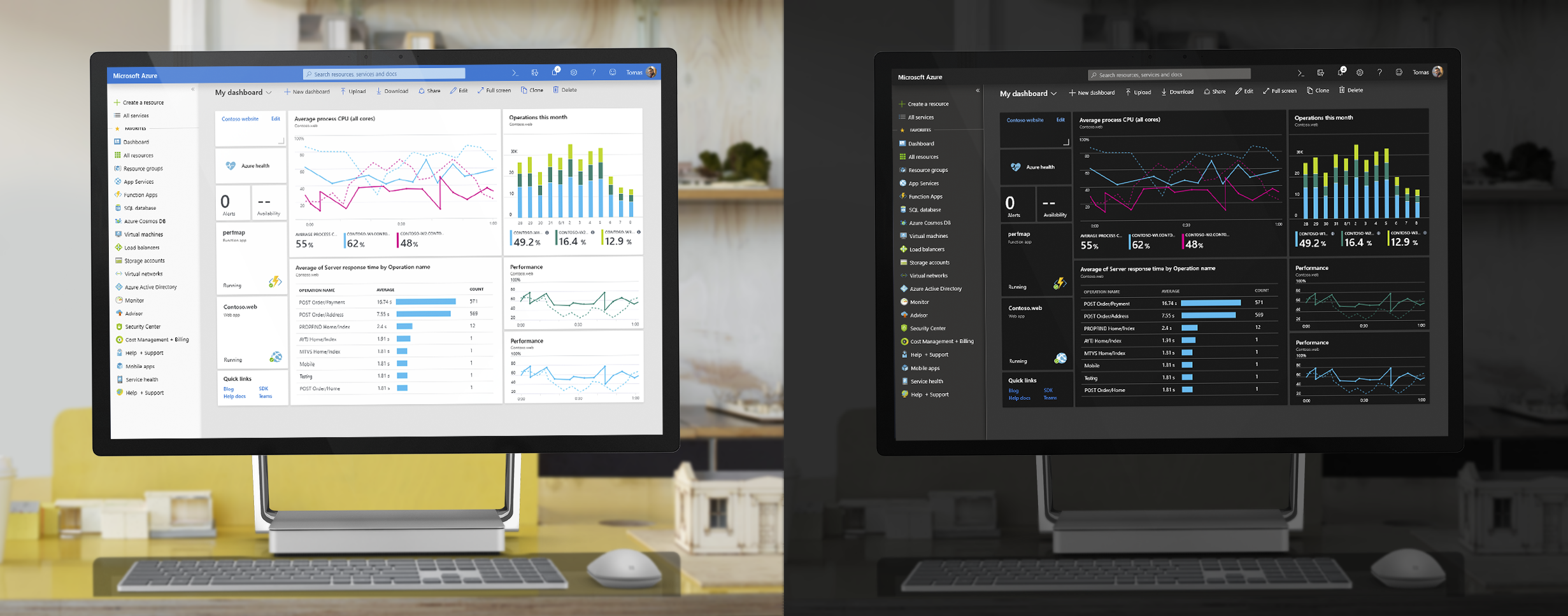
Back in 2018, the Azure Portal offered four color themes. The Blue theme was the default, used by about 78% of users. The Dark theme quickly became the developer favorite — in our studies, every developer mentioned preferring it for its contrast and reduced eye strain.
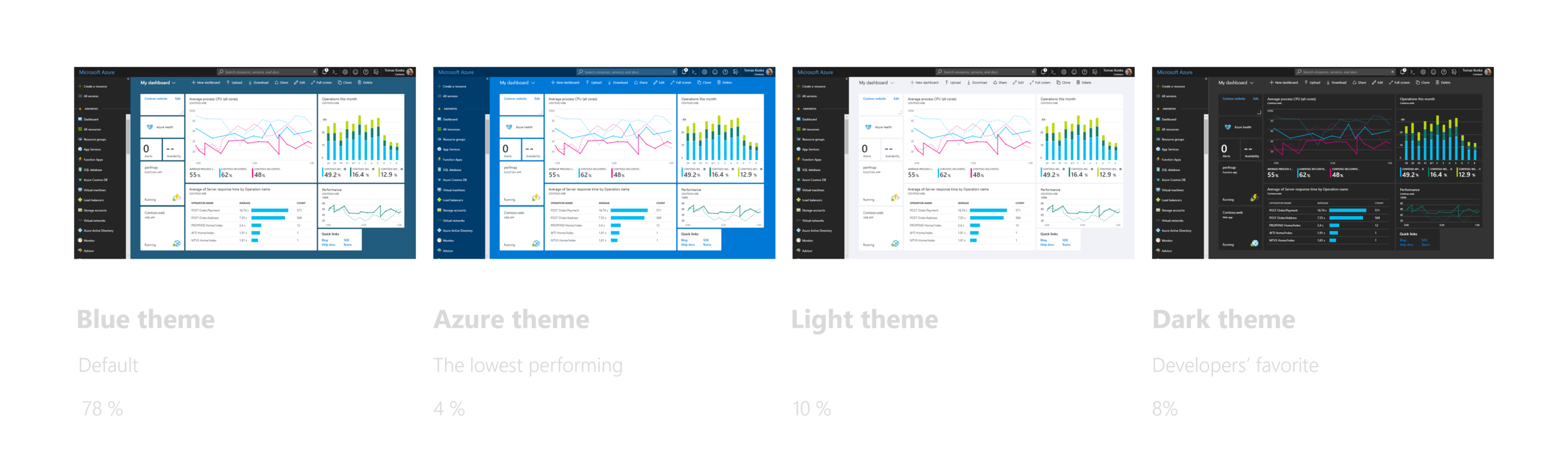
We improved each theme with minimal visual changes — a core design principle to keep the experience familiar while achieving a cohesive Fluent look. In the blue theme, we lightened the search box to improve contrast and accessibility.

In the light theme, We changed the background color for the breadcrumb and blade header from dark grey to white in order to make them visually belong to the main working space.


The new Azure theme uses an updated color palette that aligns more closely with other Microsoft services.

In the dark theme, we carefully adjusted background colors to create clear contrast between layers, making hierarchy easy to follow — and ensured key information carries the highest contrast to draw focus.


We refined core UI components to align not only with Fluent principles, but also with other Microsoft services — speaking a unified One Microsoft design language that creates familiarity across products while improving usability, accessibility, and visual harmony.
To align with other Microsoft service header designs, we applied the same design principles in the Azure Portal — making the fewest possible visual changes while achieving a consistent and cohesive header design. This approach kept the experience familiar for our users while visually connecting Azure with the rest of Microsoft’s ecosystem.
Header

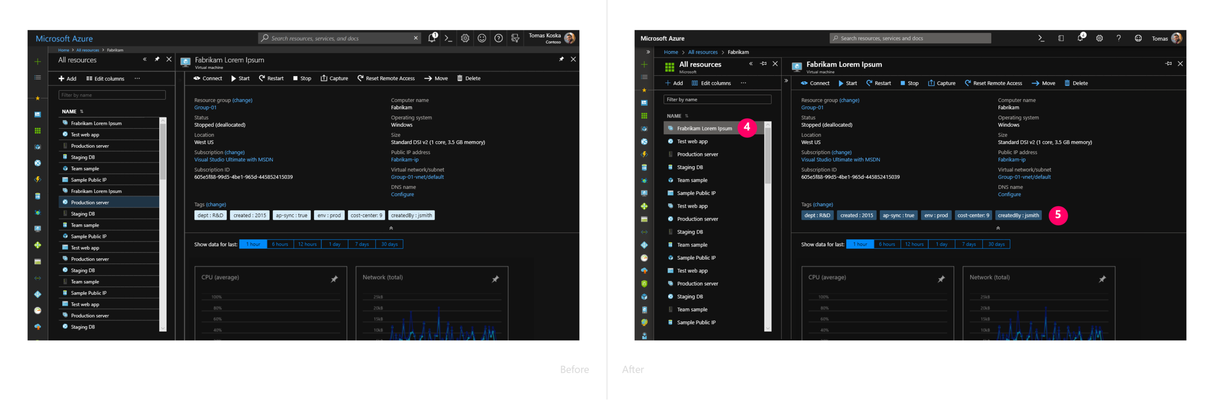
We updated line heights across the Azure Portal to align with Microsoft’s new standard size. This not only created better consistency with other Microsoft services, but also improved usability and accessibility.
We also applied the same corner radius used on Surface devices to the details of our dashboard tile corners.This small but intentional adjustment helps create a more cohesive look and feel across Microsoft’s hardware and software — reinforcing that sense of One Microsoft design unity.